Well, maybe. I love charts and beautiful and imaginative ways of representing data, and I discovered a new type of chart -at least for me- because of the labor of love of a gentleman called Phineas. You can see how plastic waste is processed HERE, in his appropriately titled blog “Sankey Diagrams”. For 15 years he has been posting examples, and he just decided last year to pass the baton. So he published his last chart in November 2021. But that’s about as last as it will be.
As for the the diagram, they are named after Matthew H. Sankey, an Irish engineer who used them for the first time.
Sankey diagrams are arguably a better way to represent relative contributions than in a pie chart, and they offer much more information in an organized and intuitive fashion.
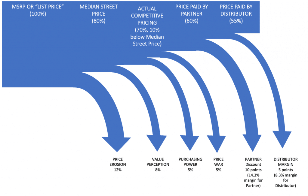
After seeing these, I figured that we have been doing it all wrong, and that we could use Sankey diagrams to represent how price changes through the value chain. Here is my attempt at a hypothetical technology product going through a two-tier distribution chain. The values are merely illustrative and I hope that the don’t incense anybody’s emotions.

I am not sure how many times have I tried to explain these value chains and the implication to channel partners to glazed-over-eyes executives. Perhaps this representation would have helped to make it more evident, that while the perceived margin of the partner, seems to 40% (given that they are granted according to this graph a 40% discount over list), their effective margin is only 14%, and that’s how they are going to value your business.
What do you think? Useful? What other scenarios would you use them for? What do you have to say about good old Phineas, teaching us about Sankey charts for more than a decade?
I just got to say, Thank you!
