If you follow me, you are probably either sick of hearing me talk about them, or you are already a believer that the world has gone exponential. I just wish it would be as simple as to ask anybody to just recognize that there have been probably more advances in the last 10 years than during the century before; that I could just instantly share that feeling that there is a new thing every week, even every day, and that the things that were hip just a few months ago are quickly becoming obsolete and even embarrassing.
Then there is the inevitability of it all. How do we know if it will ever slow back again? will it always be like this?
Like with any strong belief, they first hit us with an intuitive blow, and only after we have faith in them is when we find the logical explanations to what we already know. How do you make an argument for exponentiality?
True exponentiality, is not just about speed, but about things getting ever faster. With the linear thinking we are accustomed to, it may seem hard to believe that there are no limits for how fast can we go.
Starting with something much simpler, something that can be experienced during a more intuitive timeframe, can help to understand what we are facing.
I am referring to how individual technologies are introduced, something that we have seen many times in our lifetime. This is also a concept that I have caught Peter Diamandis mention almost in a throwaway fashion in many of his talks, usually as “hundreds of compounding ‘s’ curves…”. I think that the concept is so important, that it deserves an article like this.
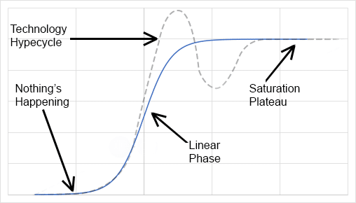
Most technologies take some time to develop and to become truly useful. Some, when first introduced, don’t even have a use-case that would help with their adoption, and even when products or solutions mature and have all the features needed, it takes some time to go mainstream. As a result, the introduction of most technologies ends up following something like an “S curve” (or “sigmoid” for its mathematical function). The “technology hype” graph (with its typical shape shown below with a dashed line), is a slight variation, with an initial overshot accounting for the overexcitement and initial hype.

In the first phase, progress is slow, and it looks like nothing’s happening, almost a failure, but then, something creates cloth and the public starts to adopt the new technology. We enter the growth phase. At this point, progress seems almost linear, predictable. It is tempting to think that growth will continue at that trend. New ventures many times capitalize on this trend to predict exorbitant valuations and secure funding.
Eventually, either because the market becomes saturated and the pool of new customers is depleted, or because the success of the business attracts competitors, growth begins to slow down, and a “plateau” develops. With purely fad-driven innovations, there is even some kind of decline, but usually, if the technology has a true advantage and it adds value, it stays around for much longer than after the headlines stop talking about it.
Now I am going to make a leap. A small one, but still a leap. I will say that the overall benefits that a technology provides to society at large, follow an S-curve as well. No adoption, no benefit. Maximum adoption, maximum benefit. We can call this the “technology benefit”, or “technology impact” curve. You may argue that there are some technologies that don’t require a lot of adoption to have an impact, but they still need to be adopted by the few users that are needed to have an impact, and they will still have a period of no impact, and then, after a while, top impact.
Interestingly enough, technology introduction is not the only place where these types of curves come into play. They seem to be connected to a variety of natural processes. Actually, in the very definition of the sigmoid function on Wikipedia, this behavior is mentioned to be related to learning curves, crop yield, titration curves, etc.
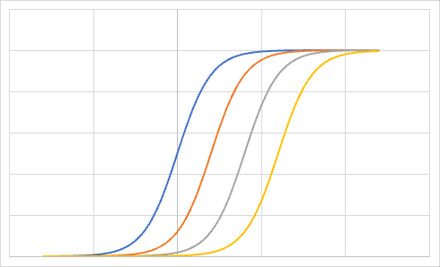
But innovations don’t happen in isolation. There are a number of technologies being adopted at any given time, at different stages in their cycle. In reality, you may have dozens, hundreds of these S-curves overlapping at different times. It is easy to accept that this is the overall approximate behavior of any technology’s impact because we have seen it before. If we consider that there seems to be a new, smaller invention, or improvement coming out all the time, we’ll have something like the graph below.

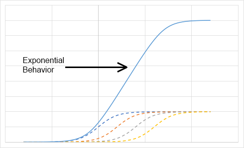
So far, good? Alright!, so here is what happens when these individual S-curves are added together to calculate the overall “technology impact”:

This is without even considering that some technologies may have a larger impact than others (the curves in the example above had a maximum plateau of one). Now, the first part of that curve looks way too much like an exponential, and it only plateaus out because I stopped at four “inventions”. According to this reasoning, as long as we keep coming out with small, incremental improvements, the result will never plateau out, and will be a full exponential, going up, into the right, getting steeper and steeper all the time.
By this, if we accept our “S” curve model, and that there are endless small innovations possible, then the world has gone exponential, and will never go back to what it was. We will continue to see changes coming at us ever faster, continuing to accelerate.
But what does this really mean for all of us? Can’t we just get off the train? Jump off the treadmill?
More on that on the next episode in this series.
NOTE: A version of this article was published a couple of weeks ago on EXOInsight.
